Thursday 15 April 2010

Looking back at your preliminary task (the school magazine task), what do you feel you have learnt in the progression from it to full product?


There are many skills and methods I have learnt from first creating my school magazine cover to completing my music magazine pages. These all include layout including images and text, use of imagery with the sizing of images and placement, various fonts which differ from small thin text to large bold text and how to address my target audience. This has been achieved by using new and effective technologies to research and annotate successful magazines as well as to complete my final music magazine front cover, contents page and double page spread.

What have you learnt about technologies from the process of constructing this product?

The main programs I have used throughout are InDesign and Photoshop. I have found these fairly easy to use and to pick up quickly and effectively. These programs have allowed me to alter my own images and text to a high standard to make my magazine look realistic and it's best. I used effect tools such as 'blur', 'magnetic lasso', 'sharpen' and 'crop' to do this.

I used these programs on a Mac computer and Macbook which I also found easy to use. This product allowed me to use the programs which would make my magazine look realistic.

I also used a high quality digital camera to make my images which I used in my magazine in various areas. I also found this easy to use and manoeuvre without the images becoming blurred due to camera shake.

I also used various other technologies such as websites which include Blogger and Flickr.

How did you attract/address your audience?


Who would be the audience for your media product?

The target audience for my magazine will be teenagers aged 14-18 and the majority being male (80%). These would be interested in hip hop music and the artists themselves, knowing their backgrounds and personal lives. The teenage audience would dress trendy and fit the stereotypical teenage appearance; jeans, trainers, jumpers and shirts. Their favourite television programmes would be most music channels such as MTV and possibly other popular programmes such as Hollyoaks which relates to teenagers.

They would purchase this magazine because it will feature the latest hip hop music along with the latest artists, news, gossip and several interviews with the successful and upcoming artists.This magazine will provide information which the audience will talk and chat about with their friends who want to be the first to know all the latest news and song releases.

What kind of media institution might distribute your media product and why?

With my magazine being based on music, one media institution which could distribute my magazine is Bauer Media Group. This is because the company distributes several successful music magazines such as Kerrang and Q. This institution may be looking to reach alternative age groups as the majority of music magazines focus on adults. My magazine is aimed at teenagers and could be exactly what the company is looking for. Bauer Media Group could also market my magazine involving several well known social networking sites which also focus on younger audiences. These could include Twitter or Facebook. This will benefit the institution as this is one very popular area of the market which is easy to target and spread the word advertising the magazine. Bauer is known to market their products further using such areas as radio and television. They do this using 'Bauer Radio' and 'Box Television'. This is also a successful way of targeting the teenage audience.

How does your media product represent particular social groups?

The image on the left is from my own music magazine whereas the other is from a very successful music magazine VIBE. My image is taken of a model whereas the other is of a well known artist. There are several similarities along with other differences between these images. They are both similar artists and I tried to show the same effect with my magazine. A strong similarity which gives off the best effect is the facial emotions which both show a relaxed but smug effect, with the artist staring into the camera directly at the audience. The body effect is also similar with both showing the same emotions however the positioning of the arms are different with my image showing the artists hands in his jumper pockets, whereas the real magazine image shows the artist with his arms crossed. The clothing is different due to the fact of the age difference between the artists and their look. The VIBE magazine image has the figure wearing a black vest top which highlights his tattoos to portray his attitude and appearance. My artist however is wearing a hooded jumper to relate to his age group and their stereotypical appearance.


Wednesday 24 March 2010

In what ways does your Media product use, develop or challenge forms and conventions of real Media products?

The title, or masthead, of my music magazine,TUNE, is displayed at the top left of the front cover, covering the majority of the width of the page. This is usually seen in most magazines of various genres. It also follows the rest of the magazines colour scheme, being blue and black. This is a convention which many successful magazines use. The TUNE font is smooth with rounded edges to suggest a free and flowing mood, to relate to the genre of music, being hip hop.
I feel this is a very common style of font for a hip hop music magazine title as it connects to the rhythm of music and tunes, but also portrays the many hip hop artists look and style.

VIBE is a very successful hip hop magazine which uses a similar font and style to its masthead. This too has a smooth plain style to relate to the hip hop genre. However, this music magazine regularly changes the colour scheme along with the title, which isn't a norm of magazines:


Mise-en-scene of images
For my front cover the mise-en-scene of the images is very important, as for nearly all magazines the images are the main focal point and what draws the audience in. With my main image I decided to place it on the right side of the page as this is also a norm for many magazines of all genres. The other images I have included on my front cover relate to an interview and following of an artist on tour inside the magazine. These images are small to not dominate the page and overshadow the main advertisement and image. I chose to place these at angles with white borders to portray a sort of photo album look.

For my contents page I used an image of headphones to relate back to the music genre, as this style is referred to hip hop, you would not see headphones in most other genres. All of the other images used are small and contain white borders to fit the photo album effect I used on my front cover.

I also used the photo album look on my double page spread, where the images related to the interview of the chosen artist. The other image which dominates the left page shows the artist who is interviewed, and is placed over the main text to show his dominance, along with the look of arrogance. The main image which covers both pages relates to the main purpose of the interview, revealing the artists life outside of music and this image can portray an open atmosphere, away from the comfort zone.

Costumes and props
On the front cover the clothes that the artist is wearing relates to most teenagers who are interested in hip hop music, hoodies and jeans. The other images of another artist shows similar clothing, jacket and jeans to again relate to the genre of music and target audience.

On my contents page, similar clothes are used for other artists along with the prop headphones being used. This again refers to the genre of music and target audience, as many teenagers are now wearing the big headphones.

On the double page spread, the artists on show are wearing checkered shirts to suggest the genre of music and target audience as teenagers are often known for wearing this style of fashion, along with the traditional jackets and hoodies. The prop of the bus relates to the information within the interview and adds a sense of mystery before reading the text.

Music genre and how your magazine suggests it
The music genre which my magazine is referring to is hip hop. This is shown and suggests it in various ways in my opinion. Firstly it is the images of the artists and how they are presented, along with the colour scheme used throughout the magazine. These bright colours, blue, yellow and white can relate to the hip hop genre and its style of music. The best example of these colours in my opinion are shown on the double page spread. The text and font can suggest the hip hop genre as the large fonts use a smooth rhythm along with the wording of the text and names of the artists.

Written content
The content within my music magazine pages is both easy to read and easy to understand and there is no background colours or images which effect the text. The large text on the front cover is noticeable from a distance to highlight the artist and draw the audience in. This is a norm for all well known magazines. The magazines features content such as lists of artists, various advertisements which highlight content inside the magazine and paragraphs of text showing information from an interview. There is also some text which relates to the way the target audience, teenagers, speak to each other with words and phrases such as 'bookies favourites' an the title itself, TUNE.

Layout
Getting the layout right for all of my magazine pages is important. I kept to many norms and conventions of most successful magazines when deciding my final layout, especially for my front cover, as this is the most important page as it attracts the target audience. Some conventions which I used in my magazine include the layout of images, size and placing of the masthead and positioning of the advertisements and main and small texts. The double page spread I contains the most conventions when relating to layout, I feel, as just like many magazines the interview or text dominates one page whereas the images and small quotes dominate the other, along with the background image crossing both pages.

Sunday 28 February 2010

Tune Music Magazine Contents Page

AFTER
Looking at my contents page from a distance, I realised that some of the text was hard to read. For example, the sub-text underneath the page numbers was similar to the majority of text, and as this is smaller it was more difficult to read. I decided to alter this to a plain and simple text which was easy to read, especially from a distance. I did this in several areas including one of the main infomation boxes regarding an artist. Also, I change the colour of some texts including the sub-text underneath the interview advert and page number. Finally I chose to add another box outline which surrounds the band search area. I thought it would make this part stand out a little more as it is a key area of the contents page.
BEFORE

Tune Music Magazine Front Cover

AFTER
I decided to alter some areas of my front cover as I noticed it was missing several forms and conventions of real magazines, which would improve the overall look and feel of the front cover. For example, the main text advertising a well known artist which relates to the main image is too similar to the surrounding text and does not stand out from the rest. I chose to make the artists name in big text in a brighter colour to stand out over the rest of the text on the page, along with enlarging the sub-text to also stand out but not overshadow the artists name. This is a form and convention of many music magazines, having the main artist dominating the page with the related text also standing out the most. Other parts which I altered include the size of the advertisement at the top of the cover so this too would stand out and fit the conventions of magazines, where this would cover the top of the page. I also changed the size of the text on the left hand side, where the main parts are more visible and easier to read from a distance along with the smaller writing not having a stroke effect (outline colour of the text). I feel these changes has improved the overall front cover as it looks more like a real music magazine with more forms and conventions .
BEFORE

Tune Magazine Front Cover Step-by-step

This step-by-step shows how my magazine began to progress to a finalized piece. I decided to alter the background brick wall image to make it look more fresh and professional, but also a real feel relating to many well known music magazines. By using Photoshop I was able to add a shadow to the figure onto the background wall. I feel by using this technique the overall look and layout is more proffessional and realistic.

Tune Magazine Front Cover Possible Images

These are my own taken 3 possible photographs where one will be the main image I will use for my music magazine front cover. My initial thought is to use the centre image as the figure is looking directly at the audience, which from research is a common norm on all music magazines. I think his clothing will fit the theme and target audience for my magazine; hip hop and young teenagers.

Thursday 14 January 2010

Music Magazine Colour Designs


From these colour designs I can see which ones are most effective and relate to the genre of music which I am focusing on; hip hop. I feel the blue/yellow and pink/turquoise works the best as the masthead and text stands out over the background colours. They also relate to the genre hip hop as the bright loud colours reflect the type of music. I will decide which one works the best when I include my own main image onto the design. This image will have to stick to the main colour scheme on the front cover.

Music Magazine Design

This is my black and white music magazine front cover design. I feel this is an effective design as the logo is big and bold and will stand out over the rest of the text. Also, the main image will be big and focussed in the centre of the cover with the smaller text running down the side of the image, this is common with most magazines which I have noticed in my research of front covers. There will be advertisements at the top and bottom of the cover advertising what is included in the magazine, which is again very common and a norm for most well known magazines. Another norm it will have is a slogan underneath the masthead which is catchy and reflects the magazine. Other essentials will be the bar code and price. I will look at various colour designs for this to see which one is most eye-catching and relevant to the genre of music, being hip hop.

Music Magazine Mood Board (Contents)

Wednesday 13 January 2010

Music Magazine Mood Board (Front Covers)

Evaluation of School magazine (front cover and contents page)

My school magazine front and contents pages both capture the conventions of a real ordinary magazine. It contains a large, bold and clear logo which I know is essential for a good quality and selling magazine. This logo in my opinion can relate to school life and many students, as the title ‘SCHOOL’S OUT’ captures pupils attention as it suggests it is time out of education to relax, however they will be reflecting on the school and learning as a whole gathering new useful information when reading. I put the logo on both pages to keep to the same style and design and not loose the effect it gives like many other magazines.

Other essentials that are used on every selling magazine include a barcode, date, price and possibly a slogan which nearly all well know magazines have these days, rather than when they started publishing. All of the text on the page is visible and easy to read even from a distance. The texts on both pages are all the same or similar colours to keep the traditional patterns and looks that various magazines stick to.

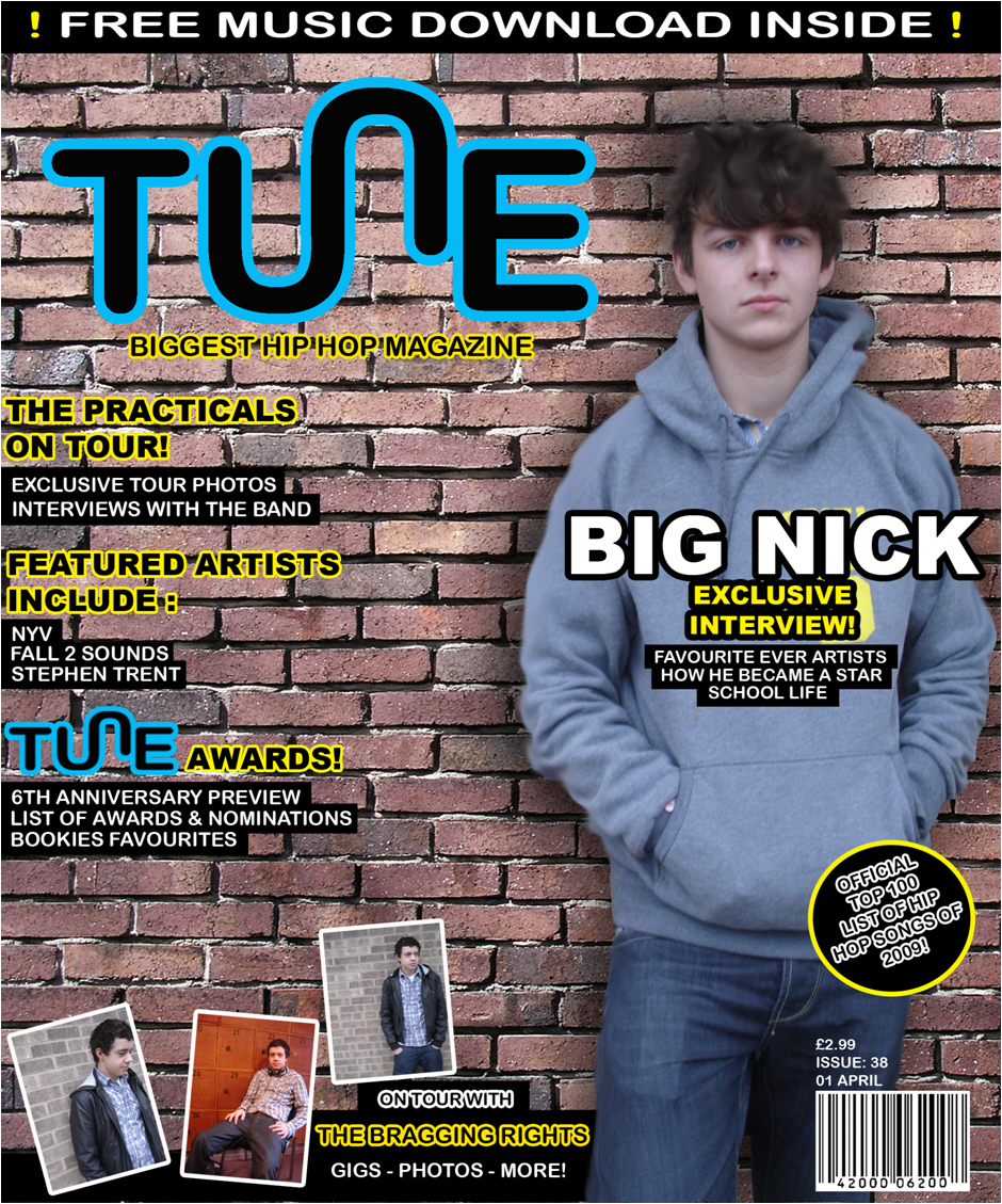
The medium close up of a student covering the background reflects many magazines, as they all usually show one main image which stands out (this is normally a person). This image is also mainly placed in the centre or one side of the magazine, with the text on the other. This is the layout I used because my research showed many best selling magazines are similar and I wanted to make mine look and feel real in the same ways.

I think another main part of my front cover which gives the professional look of an actually magazine, is the few small images on both the front and contents pages. This is because the audience is mainly attracted to the photography in the magazines. I placed them at an angle to reflect the modern day designs as they are much more advanced, with images overlapping text etc.

I used a desk top publisher (DTP) to create most of my front cover and contents page. I found it useful to manipulate the imagery and text, especially when re-arranging the layout. I used a design programe to create my logo to give it a good look and to have the similar finish like other magazines.

I believe I reflect the values of the target audience as I show what information that is included in the magazine, using images which are eye catching.

The main aim of my magazine, if it was real and available to students, is to give them what they want and more, and for each pupil to look forward to the next issue.

Creating these two pages will help me design and create my final music magazine pages, with the different uses of imagery and layout.